Three years later, an update:
Windows 8 sucked.
I still maintain that it was an awesome tablet OS in 2012, but it did not run on any good tablets. It still doesn’t. The Surface — thank the gods I never bought one — was heavy, bulky, loud and had terrible battery life. Surface 3 is better, but still nowhere near the state of the art.
Meanwhile, the ecosystem is quickly catching up. The value of running x86 Windows applications has dropped dramatically in the three years since this piece was written. Most of the other features that made Windows 8 interesting have been copied by iOS and Android — all the way down to the Metro design.
Today, a phone, a Bluetooth keyboard and a TV to cast to is actually a surprisingly good desktop replacement. And it’ll only get better.
RIP Windows.
I’m excited about Windows 8.
There, I said it.
I have five Linux devices in my home, I write Python in Vim on Ubuntu professionally, and I have rolled my eyes at every major shift in Windows since 3.11.
But I’m excited about Windows 8.
Before I ruin your day with my fanboy ramblings, let me clear up some reasons for why I don’t hate it (if you don’t either, feel free to skip towards the end).
“I don’t want a nerfed touch interface on my desktop!”

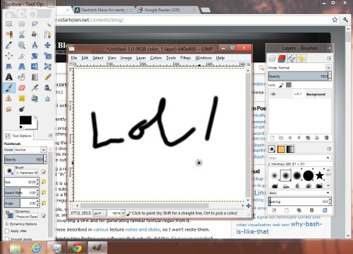
Agreed. Fortunately, as you can see from this screenshot, a Windows 8 desktop session looks just like a Windows 7 one, with efficient, dense, touch hostile apps.
Believe me, I’ll be the first to scream bloody murder if I have to develop Windows software in a touch UI with only two apps on screen.
On that note, ARM based Windows 8 devices won’t support normal desktop sessions, so x86 is implied for the rest of the article. The reason for this should become apparent later.
“I want a start menu!”

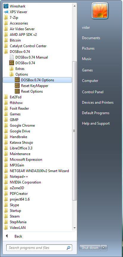
The start menu was awesome in 1998, when having 15 apps installed made you a power user. But now my entertainment PC (pictured) has 55 top level entries, and my development box has 92! In a tiny list with a huge scroll bar!
“But”, I hear you say, “that’s the full list! No uses that!”.
Quite right. The apps you love, you pin on the taskbar. This works exactly the same in Windows 8.
With your hands on the keyboard, you find by keyboard search. This works exactly the same in Windows 8.
This leaves the apps you use fairly often, which are either pinned to the start menu, or have bubbled their way up through frequent use.

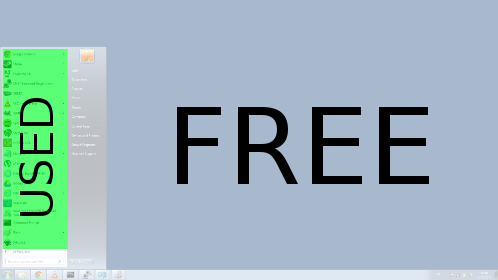
On a full HD display, the default is 20 items, with a maximum of 24. Shown in a linear list. The default uses literally less than a tenth of the available screen real estate (pictured).
On a smaller screen, you get 12-14 items, which is a very snug fit, and definitely not enough if you want shortcuts to web sites like I have on my Android and iOS devices.
So what do you do? Instead of having a short, narrow list on the left, we could lay them out in a grid (like desktop icons) to fit more of them.
And that pretty much describes the Windows 8 start screen!
Of course, you have tiles instead of icons, but I’ll get to those in a bit.
“Secure boot will block Linux and other OS!”
Maybe. I hope it doesn’t. I’m not saying it’s all cream and peaches, but hopefully it’ll continue to be optional on all devices.
Slimmer and faster!
There’s a running joke that both processing power and Windows boot time doubles every 18 months.
Windows 8, however, cold boots in 10 seconds on my low end, portable test hardware. It also uses about 30% less RAM than Windows 7.
No one is more surprised than me.
I no longer “check my email”, I get a notification when new mail is received. I no longer visit web sites regularly, I use RSS to tell me when there’s something new. Why should I still open my apps to see what’s happening?
Sure, my RSS reader could be an icon saying “RSS Reader”, but it would be more convenient if it said “Bitcoin market crashes, and 14 more”. Windows 8 does this.
My ebook reader could say “eBook reader”. Or it could say “Reading Dune, page 134 of 245”, with cover art instead of a generic icon. Windows 8 does this.
My video player could say “VLC”, or it could show a screenshot of where I stopped a video last night. Wait, *cough*, that’s a terrible idea. Windows 8 lets you disable this tile-by-tile!

One app can have multiple tiles. Just like how you can have two books on your desktop that open in the same reader, you can have two tiles. They’ll show the book title and page number separately.
For non-file based links, Win7 users can create shortcuts to invoke a program with different command line arguments (but no one does). With Windows 8, you can pin application specific contents, e.g. a Facebook contact, and have a tile representing them.
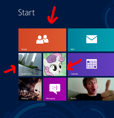
This tile will then show photos of that particular person (pictured), plus their recent activity and messages they send you. Great for close friends and people you’re dating (or stalking). When opened, you’ll go immediately to their page.
Likewise, you can have an icon for a specific Wordfeud game, showing current score and status. An often used playlist? A news source you follow closely? A specific alt in a mmorpg? Separate work and private email accounts? All available at a glance.
Honestly? While I think Windows 8 is an improvement in some ways, I probably won’t be upgrading my Windows 7 desktop/laptop systems any time soon.
However, (and here’s the twist), I will camp out a cold winter’s night to get a Microsoft Surface or similar Windows 8 tablet PC. Because you see, I consider Windows 8:
The hands down, best tablet PC OS to date
I don’t even care about Windows 8 vs GNU+Linux, I see Windows 8 tablets vs Windows desktops and iOS/Android tablets.
Why?
I hope I’ve convincingly argued that Windows 8 is not nerfed, but a complete desktop OS (“as far as Windows goes”, hurr durr).
Now, imagine that on a tablet:
Fully usable desktop — Bring it to the office, dock it with keyboard, mouse and external monitor. You can now use it as a regular PC running Visual Studio, Excel, and all that jazz!
Fully usable tablet — Bring it with you on the bus, and use it as a small, touch friendly browser and time waster, just like an iPad or Android tablet!
…in one device — Inspiration strikes? Switch back to your Visual Studio project and fix, test and commit while still on the bus.
Useful, new features — I’m sure tiles can come in handy on a desktop system, but on a tablet I think they’ll set a new standard for convenience.
No software limitations — Encounter something stupid, like not being able to run an app in the background, or not being able to search on a web page (looking at you, iPad!!)? You have a full desktop OS to fall back on!
Both toy and tool — It’s no longer just a fun but useless toy. Bittorrent a Ubuntu iso, checksum it, and write it out to a thumb drive? Sure thing!
Want to demo something? Want to script something? You got it.
I would ditch my iPad 2 in a second.
Seriously?
Seriously.
And yes, I think it will work in practice. You see, it already has:
I loved Maemo, the Debian based cell phone OS featuring xterm and a GNU toolset in the factory default. Like Windows 8, Maemo had a touch UI for normal operation, but also allowed you to go behind the scenes and run “proper” software.
While I obviously spent most of my time in the touch UI, Maemo was there for me when I needed more. Granted, not everyone feels they have to strip and encode the audio track from a youtube video on their phones, but the core point remains:
When someone with a modern, online, multi-gigabyte, multi-core tablet says “Oh darn, I can’t. I don’t have a computer with me”, something is tragically wrong.
And that’s why I can’t wait for Windows 8.
PS: I’ve written “Windows 8” a total of twenty-three times in this article. I promise that nothing like this will ever happen again.